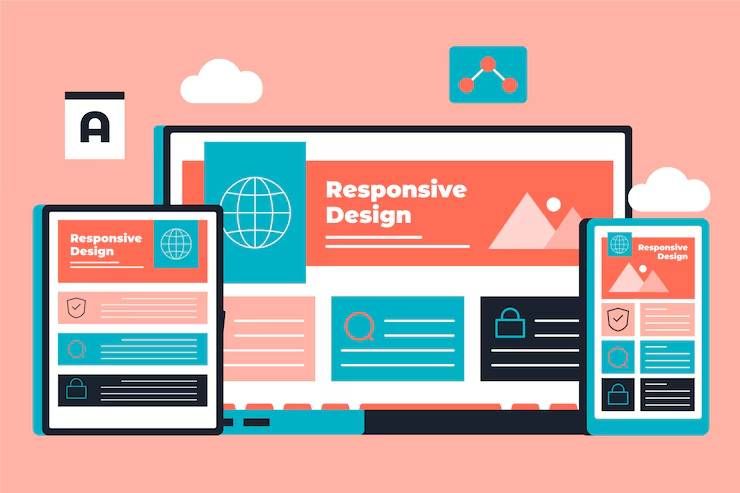
Responsive web design is an approach to creating websites that adapt their layout and content to different screen sizes, orientations, and devices.
Instead of designing a separate fixed layout for every device, responsive design uses flexible structures so that a website can work across smartphones, tablets, laptops, and large desktop screens.
The approach became increasingly important as people began accessing the internet through many types of devices. A page designed only for a large monitor may require excessive zooming or horizontal scrolling on a phone. Responsive design addresses this problem by allowing page elements to adjust according to the available screen space.
Common responsive techniques include:
- Flexible grids and layouts
- CSS media queries
- CSS Grid and Flexbox
- Responsive images and video
-
Relative units such as percentages,
rem, andem - Flexible typography
- Container queries
- Mobile-first development
- Accessible navigation and controls
The main principle is simple: the content should adapt to the user's viewing environment rather than forcing the user to adapt to the page.
Why Responsive Design Matters
Responsive design affects usability, accessibility, performance, and content presentation. It is relevant to website owners, developers, designers, content teams, organizations, and anyone responsible for maintaining a digital platform.
A responsive interface can help address common problems such as:
- Text that is difficult to read on small screens
- Buttons that are too small to use comfortably
- Images extending beyond the screen
- Menus that become difficult to navigate
- Tables requiring excessive horizontal movement
- Content becoming distorted at unusual screen widths
- Different layouts behaving inconsistently across devices
Mobile devices are particularly important because screen space is limited. A desktop layout may contain several columns, while a phone may need to display the same information in a single-column arrangement.
Responsive design also supports accessibility. For example, WCAG guidance includes requirements intended to prevent content from requiring unnecessary two-dimensional scrolling at narrow viewport sizes. India's GIGW 3.0 specifically advises the use of responsive techniques such as media queries, Grid, or Flexbox for this purpose.
Core Responsive Web Design Principles
Start with a flexible layout.
A responsive layout should not depend on fixed pixel widths for every major element. CSS Grid and Flexbox can allow columns, cards, navigation areas, and other components to reorganize as available space changes.
Use a mobile-first approach.
Mobile-first design begins with the constraints of a smaller screen and progressively adds layout features for larger screens. This encourages designers to prioritize important content instead of simply shrinking a desktop page.
Use breakpoints based on content.
Breakpoints should not be selected only because a particular phone or tablet has a certain screen width. A better approach is to introduce a breakpoint when the content or layout begins to look crowded or difficult to use.
Make images flexible.
Large images should scale within their containers. Responsive image techniques can also provide different image sizes depending on the viewing environment, helping avoid unnecessary data transfer.
Design readable typography.
Text should remain readable without requiring users to zoom. Relative units and responsive typography techniques can help headings and body text adapt to available space.
Keep controls usable.
Navigation links, buttons, form fields, and other interactive elements should remain easy to identify and operate on touchscreens as well as with a mouse or keyboard.
Responsive Design and Accessibility
Responsive design and accessibility are closely connected but are not identical. A page can adjust correctly to different screen sizes while still creating barriers for people using screen readers, keyboards, magnification, or other assistive technologies.
Important practices include:
- Using semantic HTML
- Providing meaningful alternative text
- Maintaining sufficient color contrast
- Supporting keyboard navigation
- Keeping focus indicators visible
- Avoiding content that depends only on color
- Allowing text to resize appropriately
- Keeping forms understandable
- Testing different zoom levels and viewport sizes
WCAG 2.2 was published by the World Wide Web Consortium as a W3C Recommendation on October 5, 2023. It added nine success criteria compared with WCAG 2.1, including additional guidance relevant to modern accessibility needs.
Recent Developments in Responsive Web Design
Responsive design continues to evolve as CSS and browser capabilities become more sophisticated.
One important development is the broader use of container queries. Traditional media queries generally respond to the viewport, while container queries allow components to respond to the size of their containing element. This can make reusable components more adaptable within complex page layouts.
In October 2025, web.dev published guidance demonstrating responsive typography with container query units and explaining how components can adapt to different container contexts.
Browser compatibility information is also becoming easier to evaluate through Baseline, a web-platform initiative that identifies features with established browser interoperability.
During 2025, several features entered Baseline, including view transitions, content-visibility, scrollbar-color, and ::details-content.
In 2026, Baseline expanded further. Features listed as newly available during 2026 include container style queries, field-sizing, contrast-color(), and several other HTML and CSS capabilities.
These developments do not eliminate the need for responsive fundamentals. Instead, they give developers more precise ways to build flexible interfaces.
| Responsive technique | Main purpose | Typical use |
|---|---|---|
| Media queries | Adapt to viewport conditions | Navigation and page layouts |
| CSS Grid | Create flexible two-dimensional layouts | Cards, dashboards, content columns |
| Flexbox | Arrange items along an axis | Navigation, buttons, toolbars |
| Container queries | Adapt components to their container | Reusable UI components |
| Responsive images | Adjust image delivery and size | Photos and illustrations |
| Relative units | Create scalable dimensions | Typography and spacing |
Laws, Policies, and Web Standards in India
Responsive web design is influenced by accessibility and digital-governance requirements in India, particularly when websites are created for government organizations.
The Guidelines for Indian Government Websites and Apps (GIGW 3.0) provide guidance for government websites and applications at central, state, district, and local levels. The guidelines focus on usability, user-centricity, accessibility, security, and lifecycle management.
GIGW 3.0 includes accessibility requirements based on WCAG 2.1 Level AA and specifically references responsive web design techniques. It states that developers should use approaches such as CSS media queries, Grid, or Flexbox to avoid problematic horizontal scrolling at narrow viewport dimensions.
The Rights of Persons with Disabilities Act, 2016 is also relevant to digital accessibility. Section 42 addresses access to information and communication technology and calls for electronic media content to be available in accessible formats.
Another recent development is India's Digital Personal Data Protection Rules, 2025, notified by the Ministry of Electronics and Information Technology on November 13, 2025. The rules establish implementation requirements under the Digital Personal Data Protection Act, 2023 and use a phased commencement structure.
For responsive design, data-protection requirements can affect the presentation of forms, privacy information, consent interfaces, account areas, and other components that collect or display personal data. Designers therefore need to consider both usability and the way important privacy information is presented across screen sizes.
Useful Tools and Resources
Several tools can help designers and developers evaluate responsive interfaces:
- Chrome DevTools: Provides device emulation, viewport testing, CSS inspection, and performance analysis.
- Firefox Developer Tools: Useful for inspecting layouts, CSS behavior, and responsive interfaces.
- W3C Web Accessibility Initiative: Provides authoritative accessibility standards and guidance.
- web.dev: Provides information about responsive design, browser capabilities, performance, and Baseline.
- Google Lighthouse: Helps evaluate performance, accessibility, SEO, and other aspects of web pages.
- PageSpeed Insights: Provides performance measurements and recommendations for improving page experience.
- GIGW: Provides India's government-oriented guidance covering accessibility, usability, security, and website quality.
A practical testing process should include several viewport widths, touch interaction, keyboard navigation, zoom, different text sizes, and slower network conditions.
Frequently Asked Questions
What is responsive web design?
Responsive web design is an approach in which website layouts and components adapt to different screen sizes, orientations, and devices.
What is the difference between responsive and mobile-first design?
Responsive design is the broader approach of adapting interfaces to different environments. Mobile-first design is a development strategy that starts with a small-screen layout and progressively enhances it for larger screens.
Are media queries still important for responsive websites?
Yes. Media queries remain an important technique for adapting layouts based on viewport characteristics. However, newer approaches such as container queries can complement them when individual components need to respond to their surrounding space.
Does responsive design automatically make a website accessible?
No. Responsive design helps with different screen sizes, but accessibility also requires appropriate structure, keyboard support, text alternatives, contrast, focus management, and other practices.
How should a responsive website be tested?
Testing should cover different screen widths, orientations, browsers, zoom levels, input methods, and network conditions. Automated tools can identify many issues, but manual testing remains important for navigation and usability.
Conclusion
Responsive web design is a fundamental approach to creating websites that remain usable across changing screen sizes and devices. Its principles include flexible layouts, mobile-first thinking, responsive media, adaptable typography, accessible controls, and appropriate CSS techniques.
Recent developments such as container queries and expanding Baseline coverage provide developers with more options for creating adaptable components. At the same time, accessibility standards such as WCAG and Indian guidance such as GIGW 3.0 reinforce the importance of designing websites that work for a broad range of users and devices.
A strong responsive design therefore goes beyond making a desktop page smaller. It considers how content, navigation, interaction, accessibility, performance, and privacy-related information should behave in different environments.